
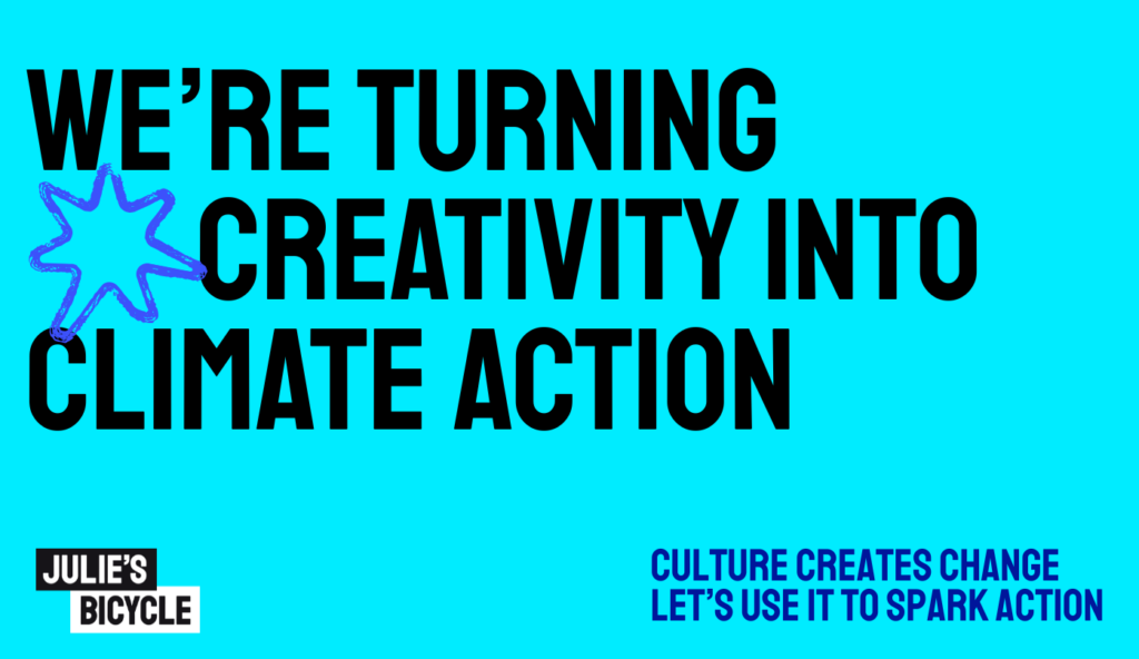

For nearly 20 years, Julie’s Bicycle has been championing the power of arts and culture to drive climate action. As the scale and complexity of today’s challenges grow, a bold new identity was needed, one that could energise, inspire, and reflect JB’s visionary leadership at the intersection of creativity and climate.
Welcome to a refreshed JB: a reinvigorated brand, a powerful new identity, yet the same commitment to turning creativity into climate action.
First, a note on our name. We used to be called Julie’s Bicycle, and we’ll still use this sometimes, but as the need for change accelerates, we thought we’d get sharper and shorter, so now you’ll see us using JB more often.
Why JB Needed a New Brand
JB was founded nearly 20 years ago, as a non-profit, rooted in the urgent need to tackle the climate crisis, and understand what the creative and cultural community can do to help – a question that continues to drive and define us.
But as the urgency of the climate and justice crises has accelerated, the world has filled with competing voices vying for attention. We needed a bolder look, sharper voice and clearer story.
JB needed a versatile new brand identity that could reflect:
- Our roots and leadership in the cultural climate movement
- The growing global scale and impact of our work
- The need to communicate to keep growing our global, diverse audience
- Our core values of justice, inclusivity, and urgency
- A modern, digital-first identity that aligned with environmental best practices
This isn’t just a refresh. It’s being on the front foot to create greater impact in the world.
The core elements of the new JB identity
1. A clear and compelling story
At the heart of the new brand is a succinct articulation of who JB is and what we stand for:
JB unites culture, creativity, and climate action to drive change.
The mission, vision, and values are distilled into language that’s bold, inclusive, and visionary, echoing our belief that creative expression is a catalyst for climate action.
The brand positioning makes it clear: JB sits uniquely at the intersection of culture and climate. We mobilise a global network of artists, institutions, and policymakers – not just to inspire, but to deliver real systems change.
2. A visual identity that reflects our purpose
The new JB identity reclaims the energy and dynamism of our origins in the music industry, using movement, texture, and bold composition to bring the brand to life.
Logo
JB now uses a dual-logo system: the full “Julie’s Bicycle” for new audiences, and a sharp, memorable “JB” monogram for recognisable shorthand. Both logos feature a stepped layout with a box-out style, nodding to the layered nature of climate issues and cultural responses.
Colour Palette
Green, blue and violet form the core brand colours to bring about a distinctive vibrancy, but also allows us to use full colour without using energy-intensive colours to display on screen. This palette allows for loud, arresting designs or quieter, more contemplative tones depending on the context.
Typography
We use Staatliches, a bold, all-uppercase font that commands attention. Body copy is set in Poppins for accessibility and consistency across platforms. These choices balance personality with clarity.
Iconography & Textures
A set of custom icons acts like punctuation for the brand’s messaging, designed to interrupt and highlight key ideas. These are paired with textured backgrounds inspired by sound waves and natural forms, evoking resonance, amplification, and the natural world JB seeks to protect.
3. A tone that inspires and empowers
JB’s tone of voice is one of our most powerful tools — grounded in five principles:
- Bold & Arresting – Clear, courageous statements that challenge the status quo.
- Visionary & Inspiring – Painting a picture of a just, regenerative future.
- Confident & Authoritative – Backed by 20 years of sector leadership.
- Urgent & Action-Driven – A rallying cry for now, not later.
- Engaging & Inclusive – Accessible, unifying, relational and community-led.
Every headline, call-to-action, and report now speaks in a voice that feels like JB: energised, expert, and deeply human.
We don’t just talk about climate action. We define it, lead it, and make it happen.
4. Digital Design with an Environmental Conscience
Sustainability isn’t just what we advocate, it’s how the JB brand was built.
From where we host our website to the design systems we’ve created, JB’s new website and visual identity are created with environmental and accessibility standards in mind:
- Energy-efficient colour choices that avoid high-emission whites and blues
- Minimalist digital design that reduces data load and server impact
- Print guidelines that avoid heavy colour usage to minimise ink and energy
- Flexible templates and reusable assets to limit waste across campaigns.
The brand demonstrates that low-impact design can still be beautiful, bold, and user-friendly.
Looking Ahead: A brand built for momentum
In reimagining its brand, JB has created more than a new logo or website. We are continuing to build momentum and an open movement, one that reflects our heritage and invites others into the journey too.
Accessibility is essential to climate justice. Communities on the frontlines of the climate crisis are often the ones facing the greatest barriers to resources, information, and participation. To reflect this, our brand and site have been designed and tested to meet higher accessibility standards.
We are an organisation that turns creativity into action. One that sees creativity not as a luxury, but as a necessity for survival. That believes in joy, in justice, and in action — not just for the few, but for the many.
No climate action without creative climate action.
Partnering with other climate, nature and justice leaders
To bring to life this bold new voice, design and site, we are grateful to have partnered with Greenhouse Communications, one of the leading environmental communications agencies and specialists in developing sustainable brands and communications across the climate and nature space. Greenhouse come highly recommend, as they have supported us every step of the way. You can see more of their work here.
Spread the word